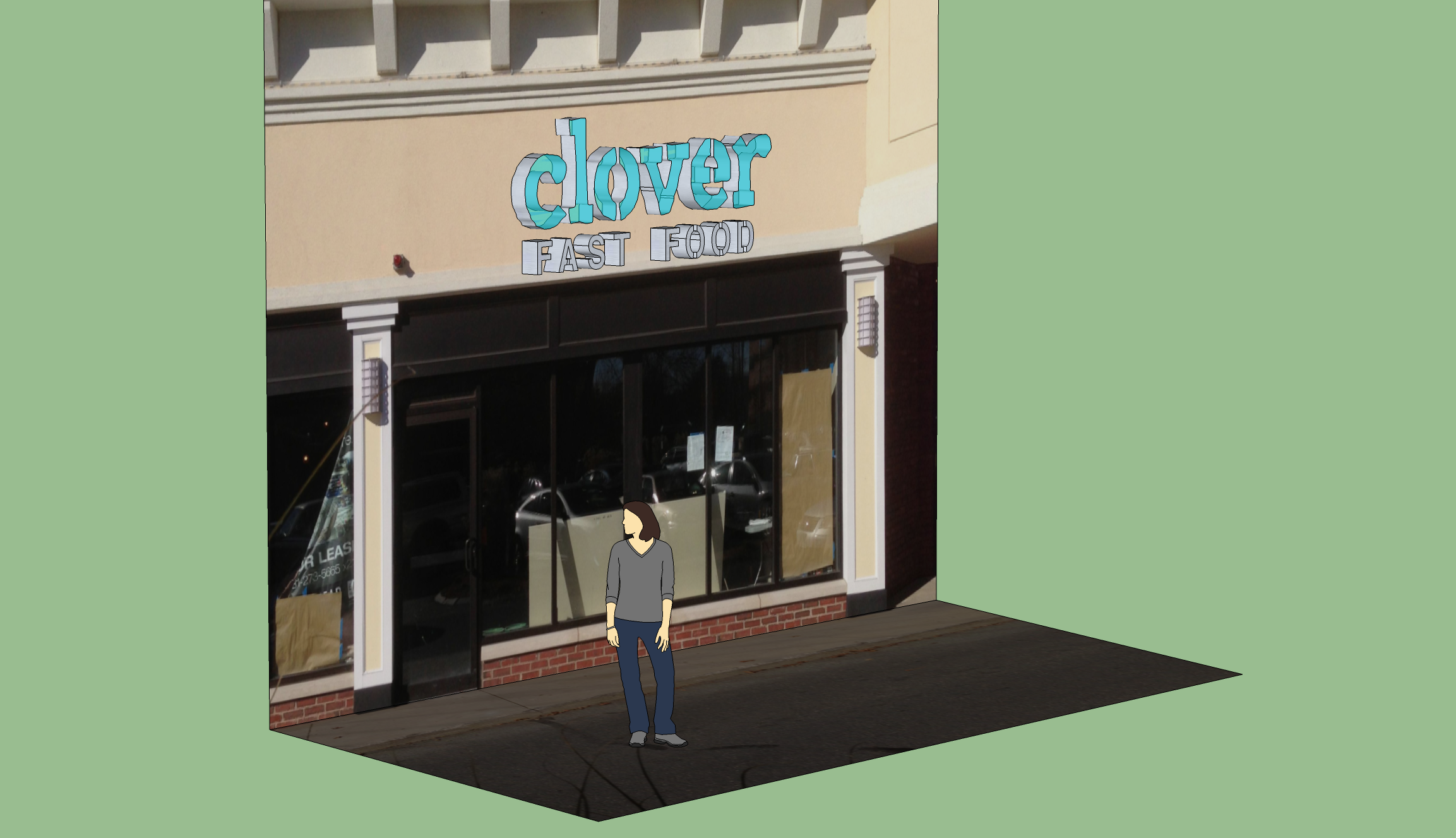
Thanks all for the ideas about the sign. I thought given the interest I should talk a bit more about the evolving design thinking.
The current favorite idea is to build a sign that would be similar in many ways to a typical sign you would expect to see in a strip mall. These letters would be illuminated from the inside, etc.
We would focus on using materials to signal a stronger sense of permenance. So I’m thinking the letters would be frosted glass, not plastic. Real glass, not sticker-laminated glass. And the frame would be aluminum, a thicker gauge than a typical sign.
I want LED lights behind the sign. They make these lights now that allow you to control/ change the color as you want. We’ve been excited about moving to a color scheme that changes every season for Clover. So at this location the logo could be dialed in to match up with the current color of the season.
The “Fast Food” would be in solid aluminum letters. Drawing less attention than the main logo.
Forgive my really terrible Sketch-up skills. I taught myself over the weekend. On the upside it’s a free program!

