We hired a design consultancy the other week. We love the C L O V E R logo that we’ve evolved over the years. It looks awesome large. Reflects transparency we care so much about. Reflects our history of the trucks (stencil) and contributions of our staff (Mary traced the current outline).
But it doesn’t work small. It doesn’t work in a square format (e.g., App button). And it doesn’t work on the restaurants as a “flag” sign — that type of sign that sticks out from the restaurant.
Many companies end up with a “word” logo as well as an “icon” logo for this reason. We just never got the icon together. I’m not nuts about Starbucks coffee, but I love their mermaid logo. Look up the evolution. The original was killer. But the current is pretty fun (if less risqué). On the other end of the spectrum you have Panera and Sweetgreen. The mother of bread feels very 1994. And the “SG” seems like somebody just couldn’t be bothered. And very hipster/ of the moment. I really don’t want to go either of those directions.
We’ve been playing with a Clover flower for years. Literal. A tiny bit surprising. Not as overplayed as the 4-leaf Clover. And we’ve played with a beaker (get it? lab).
But I haven’t landed on something I’m totally happy with. We love the graphic identity that our friends at Little Wolf have. So I asked them who they worked with. They put us in touch with Perky Brothers. And we hired them to do a project for us. Hopefully the result will be a killer square-ish representation of Clover. And we’ll finally have an iconic logo to go along with our C L O V E R outline logo. I’ll keep you up to date on progress…
A little known fact: most of the “clovers” we see depicted are actually oxalis, a different plant.
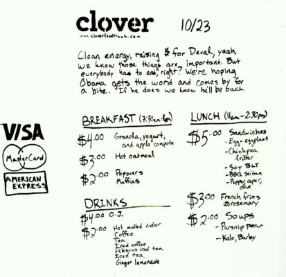
(Image of Clover menu back in 2009)
